

1. Introduction
Technology is changing rapidly and all of the of Web Developer likes to develop the website with latest and modern trend which is called “Responsive web design” to serve their customer the best user experiences. So, now let’s start talking about the importance of the Responsive web design.
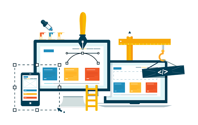
2. What is responsive web design?
2.1. Latest web layout trend
A responsive website is the latest web layout trend that the development and design must respond to the visitor’s environment and behaviour based on the platform, size and the orientation of the screen. That is, as the user moves from the desktop to the cell phone to a tablet, the website should automatically change to accommodate the resolution of that device.
With the adaptable design, there are different versions of the website in the database, which are shown depending on the device information, sent by the browser. In the case of responsive web design, it is always the same version of the site; however, it is scaled according to the device information.
2.2. CSS grid technology
To make your site more responsive you will have to use modern layout technologies like CSS Grid depending on the complexity of your website design. Another possible solution often used would be to use a media query the layout according to the “breakpoints”, making responsive customization closer to your layout objectives.
If you are using any CMS or content management systems such as WordPress, Joomla or some library of front-end components such as Bootstrap, you can develop your website in a short time, with solutions capable of responding responsively to most devices. To more about CMS please read this article “What are the needs of Content Management System or CMS”
2.3. Layouts based responsive concepts
If you are using HTML, CSS and the JavaScript language, we recommend studying and understanding the concepts and tools related to responsiveness and how the elements behave visually in the browser window and practice a lot of building layouts based on responsive concepts.
The syntax of HTML and CSS is extremely simple, but understanding the concepts and applying them correctly combined and using good practices when developing is something that requires time and patience. Because often the elements do not behave in the right way, expected when applying CSS rules such as float, specificity, relative, display, measures, position, among others. And understanding how each property works makes the process much easier.
More elaborate sites often need manual customization. After all, it is no use just having the responsive grid, you need to adjust font sizes, padding and margins to make the layout more suitable for each screen format. This type of fine-tuning needs to be done manually.
2.4. Using the Bootstrap framework
The framework depends a lot on what you want to do. If you use Bootstrap basically just to solve the page grid – that is, the text columns. It allows you to define different column widths for each breakpoints using just a few classes of CSS – this is very useful. Sites with WordPress are the most famous around the world. Because WordPress dominates more than 90% of the sites on the internet so it has a lot of options and the options are very user friendly and simple to learn.
3. The importance of responsive website design
3.1 Adaptive layout
With more and more inventions of new technologies and tools, customers want to use the best and newest tools for them. In the past, it was the only desktop computer that anyone could use. So the designers’ idea of web design didn’t work. Then laptop, smartphone, tablets came in the market.
The fact is that people who are in this modern age want to be able to browse the web easily and quickly. This means that web design is responsive to help users navigate with any type of device at hand. Web designers need to design a website that provides users with information on different screen sizes. Your website should be very diverse, as it can run on a mobile phone or a large screen such as a smart TV.
3.2 Increase web traffic
Before designing a responsive website, designers had to design many versions of their websites, which was really hard, and that was the only solution. But this solution didn’t work because the users needed to download too much of the extra designs and code were all in a bad situation for the users. Designing a responsive website is also very important from a business perspective.
This allows users to visit your website with any device they have. This will increase the traffic on your website. This is the main reason why responsive website design has become so popular and important.
4. Some features of responsive design
Many of the features of responsive website design are great and very useful for everyone. Some of the most common responsive web design features are listed below:
4.1. Time-saving:
With responsive web design, you just need to update your information on your website once. This will definitely reduce the amount of time you have to spend updating many versions of your website
- 4.2. Smart User Experiences:
The best web design answer for users is a very smooth and optimized experience on the device they have in their hands. Recently, the world’s most popular search engine “Google” has started promoting the best web design responsive in its algorithms, which helps a lot to promote your site.
4.3. User friendly:
The most popular features of responsive web design are it makes your website or web page friendly. This is because your website can use any screen size in any device. Today, the invention of technology is in great competition, and a number of smartphones are coming to market every day. So, if you have the best responsive web design, people will have the opportunity to visit your website which is useful for your website.

4.4. The mobile section:
It is also a great feature of a responsive website where you can get all the useful information about the number of traffic on your website. It doesn’t need anything, you just need to create a mobile section and you have to get the full view of the traffic that comes to your website. Traffic updates are very important to remind you of the performance of your website. It also helps you increase the changes on your website to increase traffic.

5. Conclusion
Over the course of 11 years of experience in the Web Design industry, plentiful web design projects and the acquisition of skills in responsive site-building have made Intrigue IT a prominent figure in this field. As prominent Responsive Web Design Farm, we are proud to serve our dear customers who are connected to other parts of the world and are happy to play a small role in shaping our customers’ business by building a responsive website.


19 Responses
A responsive internet site is one that has been designed to resize itself based totally on the form of device that the traveler is the usage of to view it
Thanks for your Comment
Like!! I blog quite often and I genuinely thank you for your information. The article has truly peaked my interest.
I am curious to find out what blog system you have been working
with? I’m experiencing some minor security problems with
my latest site and I would like to find something more safeguarded.
Do you have any solutions?
https://waterfallmagazine.com
An interesting discussion is worth comment.
I believe that you ought to write more on this issue, it
might not be a taboo matter but usually people don’t discuss such issues.
To the next! Many thanks!!
https://waterfallmagazine.com
Pretty nice post. I simply stumbled upon your blog
and wished to mention that I have truly loved surfing around your
weblog posts. After all I’ll be subscribing for your
rss feed and I’m hoping you write once more very soon!
Write more, thats all I have to say. Literally, it seems as though you relied on the video to make your
point. You obviously know what youre talking about, why throw away your
intelligence on just posting videos to your weblog when you could be giving us something informative to read?
I do trust all the ideas you have offered for your post.
They are really convincing and can definitely work.
Nonetheless, the posts are too quick for beginners.
May you please extend them a little from next time? Thanks for the post.